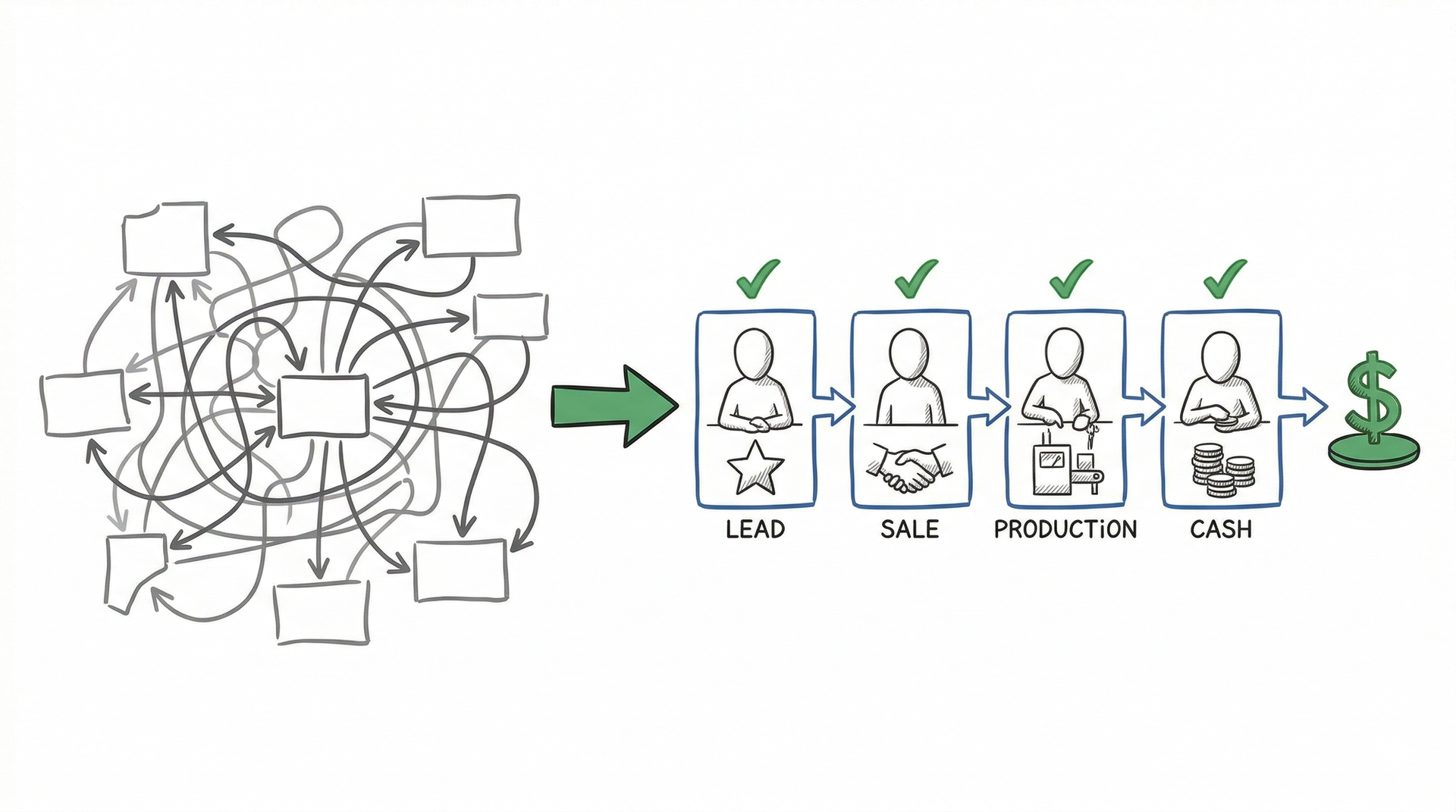
Most founders can explain how their company makes money in a conversation. Very few can draw it. And almost none can point to a single place where the whole team can see, every week, whether the company is winning or losing, where things are going wrong in the process of making money, or what is blocking them from getting cash in the bank faster.
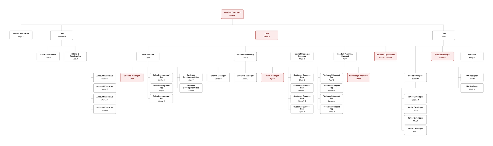
This is what a founder bottleneck looks like on paper. Sarah, the founder of Pillar HR, is flagged red on two roles. Three seats are open. The rest of this article shows you how to draw your own.
This article covers three tools that provide this clarity: the Key Function Flow Map, the Functional Organization Chart, and the Functional Accountability Chart. They build sequentially. Each one layers on top of the previous one, and you reconcile backward as you go when a downstream tool forces you to rethink an upstream answer. Together they produce the clearest view your team will ever have of how the business actually works.
If you want to jump straight to building, I have three AI-guided prompts that walk you through this process step by step.
- The KFFM Prompt interviews you about your business and produces your Key Function Flow Map: the Level 1 map first, plus any Level 2 sub-maps for the key functions you want to decompose. Widgets, owners (where you know them), and intuitive color coding on every level.
- The FOC Prompt takes your KFFM and walks you through naming owners for every key function, supporting function, and subfunction. The result is your Functional Organization Chart.
- The FAC Prompt takes your KFFM and FOC and produces the Functional Accountability Chart: missions, critical numbers, leading indicators, lagging indicators, and green / yellow / red thresholds for every function and seat.
A note on the word "function." In this article, a function is a discrete unit of accountability in your business: Marketing, Sales, Operations, Customer Success, Finance, and so on. Functions break down into subfunctions, and subfunctions can break down further. Demand Generation is a subfunction of Marketing. Sales Development is a subfunction of Sales, and Sales Development Representative outreach can be a subfunction inside that. Some functions are key functions that move money through the business. Others are supporting functions that enable them. The KFFM section goes deep on the difference.
What to expect when you click through. These prompts do not ask you thirty blank questions. Each one proposes a complete first draft using a handful of questions about your business plus industry benchmarks for your stage. You review and refine. For organizations with twelve or fewer functions you review one function at a time. For larger organizations the prompt offers an all-at-once review for speed. Web search is optional. Turn it on and the prompt looks up industry benchmarks for your stage. Leave it off and it uses built-in defaults. And you do not need every owner figured out before you start. The KFFM stays light on owners, the FOC fills them in, and the FAC layers on accountability. You can refine team membership at any step and the downstream prompts pick up your changes.
The prompts are available at darlison.com/tools/.
KFFM, FOC, and FAC
Build your KFFM, FOC, and FAC with three guided AI prompts. KFFM 30 to 45 min. FOC 30 to 45 min. FAC 45 to 90 min.
The three tools
Before going deep on any one of these, it helps to see the full picture.
The Key Function Flow Map is a simple graphical representation of how the company makes money. It shows the nonfiscal things (widgets) that flow through each function in order to put cash in the bank. Shannon Susko calls it the foundation of everything. Once it is mature (owners named, widgets clear, critical numbers in place), it provides the visible structure that a scoreboard sits on top of. The scoreboard itself is the weekly or daily update rhythm that turns the structure into a live view of whether the company is winning or losing. That rhythm is covered in Scoreboard Day and the Weekly Leadership Review.
The Functional Organization Chart is the Functional Accountability Chart viewed from the perspective of the whole organization. It is an org chart organized by function rather than by title or reporting line. If a function is accountable for subfunctions beneath it, that hierarchy is visible, just like a traditional org chart but based on functional accountability rather than management reporting. People who own multiple functions appear more than once. Open and future functions sit alongside the current ones, so the team can see where growth opportunities exist. Leadership uses it to gain clarity about how the organization is structured today and where it is growing toward. The whole company uses it to see where they fit.
The Functional Accountability Chart is a simple table. Functions, owners, and eventually critical numbers. It answers: what functions exist in this company, who owns each one, and how do we know if they are doing their job? In its simplest form it is just a list of names and functions. In its mature form it includes a critical number with green, yellow, and red thresholds, and leading and lagging indicators for each function. The FAC is what makes the scoreboard's numbers mean something.
You build these three tools in sequence. The KFFM comes first because it forces the conversation about how money flows through the business. The FOC builds on top of that, naming owners for every function on the map. The FAC builds on top of the FOC, layering on missions, critical numbers, and indicators for every seat.
But sequential does not mean linear-and-done. As you work on each downstream tool you learn things that force you to revisit the upstream one. Naming an owner for "Sales Operations" on the FOC may reveal that the function shouldn't have been on the KFFM at all. It belongs at Level 2 inside Marketing. Picking a critical number for Customer Success on the FAC may force a rename of the widget on the KFFM. That backward reconciliation is the system working. The picture sharpens through iteration. The rest of this article shows you how.
The Key Function Flow Map was created by Shannon Susko and originally called the Key Process Flow Map in 3HAG WAY. The Functional Accountability Chart was popularized by Verne Harnish (Scaling Up), Gino Wickman (Traction), and Shannon Susko (Metronomics). The Profit/X concept is Jim Collins's economic engine from Good to Great. What follows is my interpretation. I strongly recommend reading the original sources.
A worked example: Pillar HR
Throughout this article I will reference Pillar HR. It is a business-to-business software-as-a-service company at $10M annual recurring revenue, with 25+ roles, six leadership team members, and the typical "founder is the bottleneck" pattern. Pillar HR's three artifacts (KFFM, FOC, FAC) are shown below as we walk through each tool. They are the actual outputs the AI prompts produce when run end to end.
Four stages of maturation
The KFFM does not arrive fully formed. It starts as a rough sketch and tightens over multiple iterations as the team refines, reconciles, and learns. Here is what that progression looks like.
Stage 1. Functions and color coding. Identify the 3 to 5 key functions that make the company money. Draw them in the order things flow. Then color code each function based on the team's intuitive feel for what is working and what is not. Green, yellow, red. This does not require data. It requires honesty. The colors help the team decide where to focus in the next iteration. If marketing is bright red and everyone knows it, that is useful information right now.
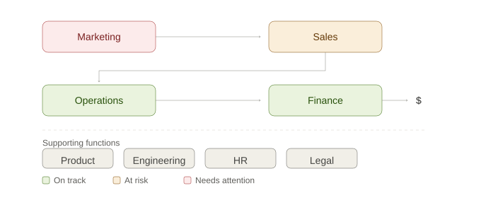
Stop here if you have more than 5 boxes. Collapse them to Level 1 functions before adding owners. Anything beyond 5 belongs at Level 2.
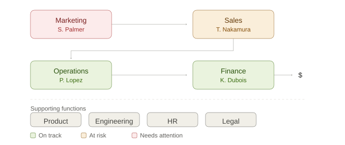
Stage 2. Add owners. Each function now has a name under it. This is where gaps (no owner), overlaps (multiple owners), and overloads (one person owns too many) become visible. Cross-reference with the Functional Accountability Chart.
Stage 3. Add widgets. The arrows between functions now have labels showing what flows between them. These are your widgets. A widget is a nonfiscal thing that flows through a function and is controlled and owned by a team member. This is the hardest step and the one that forces the most reconciliation with the other two tools. Naming the widgets confirms or challenges the functions and their order. Profit/X starts to emerge here as you see what the most important widget is in the flow.
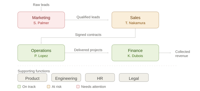
Stage 4. Add critical numbers. Each function now shows the metric and the actual versus the target. The box color moves from intuition to data. The thresholds that define green, yellow, and red live in the Functional Accountability Chart. The KFFM shows the score. The FAC defines what the score means. At Stage 4 the structure is complete; running it as a scoreboard is the next step.
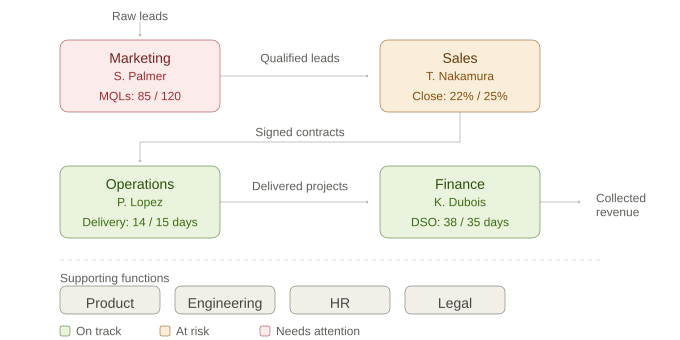
The first build is done when every key function has a named owner, a critical number, and a current color. Iterate monthly from there.
The KFFM does not arrive at Stage 4 in a single session. It takes multiple iterations. Whatever you put down now is going to be different in six months because you will have learned a lot. But the reason you will have learned a lot is because you moved. Do not sit on Stage 1 trying to make it perfect. Put something down, live with it for a month, and see what feels wrong. That is the system working.
Building the KFFM
Below is Pillar HR's mature Level 1 KFFM after running the AI prompt and a few rounds of refinement. Four key functions move a transaction from lead to cash, plus three supporting functions. Widgets are labeled on the arrows. Each function shows its owner, critical number, color status, and a link to its Level 2 map.
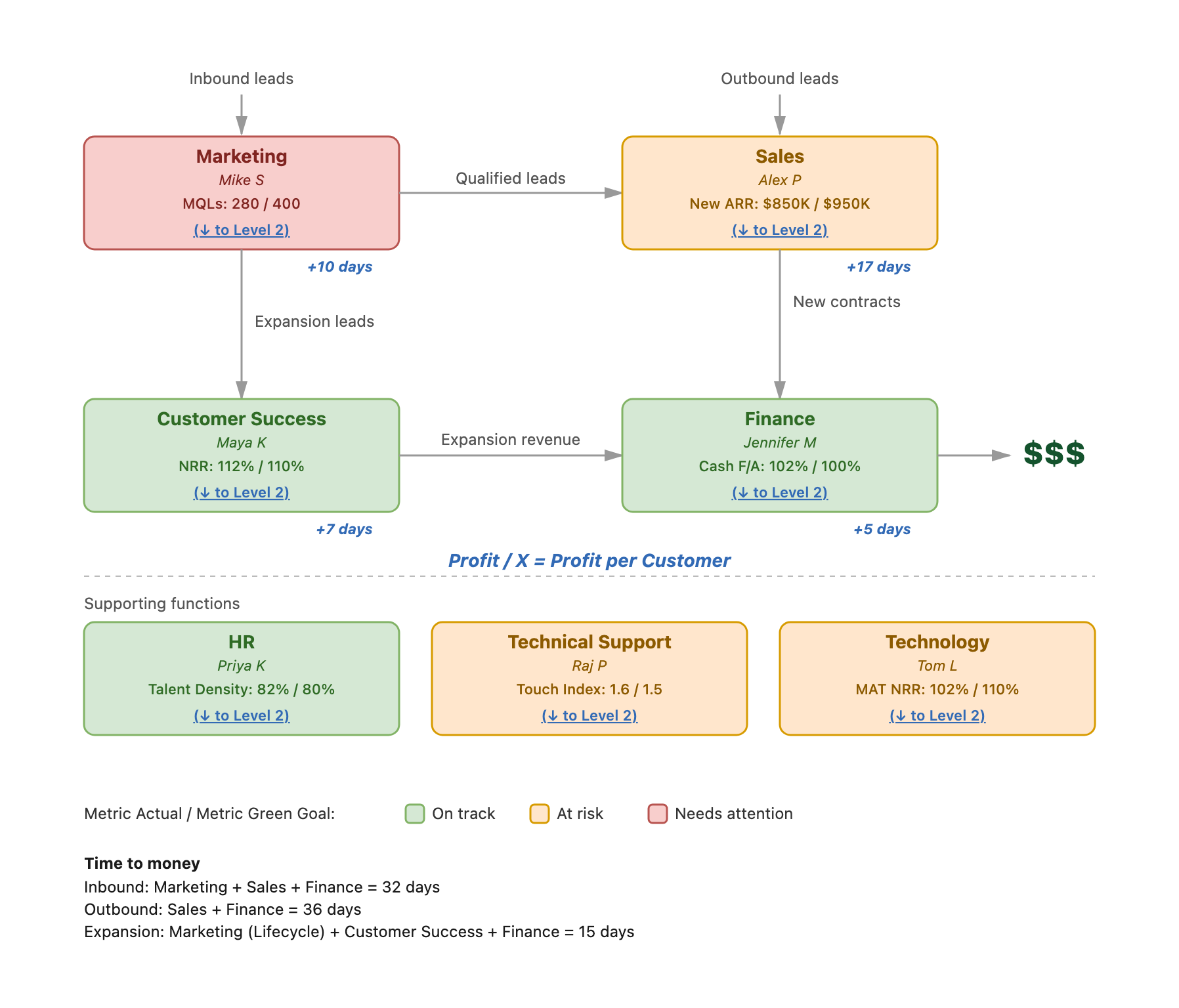
Pillar HR's Level 1 KFFM. Marketing → Sales → Customer Success → Finance is the key function flow. HR, Technical Support, and Technology are supporting functions. Profit/X is profit per Customer. Time-to-money for new business is 32 days inbound and 36 days outbound; expansion is 15 days.
Keep it to 3 to 5 functions. Your Functional Accountability Chart might have 15 functions. The KFFM is not trying to show all of them. It shows only the key functions that move a transaction from lead to cash on a regular basis.
When teams list 10 or 15 functions, they are almost always mixing levels. A function like "demand generation" is not a Level 1 key function. It is a subfunction within Marketing. "Quality assurance" is not a Level 1 key function. It is a subfunction within Operations. These are real functions with real owners, but they belong at Level 2 beneath a key function, not alongside it on the main map.
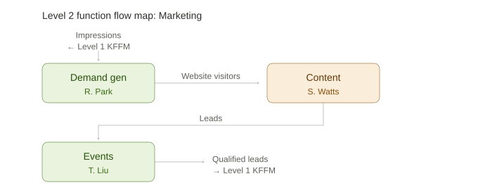
The Level 1 KFFM shows only the 3 to 5 key functions that flow cash to the bank. As the system matures, each key function can be broken down into its own function flow map at Level 2, showing the subfunctions within it. Level 2 can break further into Level 3. Functional owners build their own Level 2 function flow maps and use them as their team's scoreboard. But that comes later. Start with Level 1.
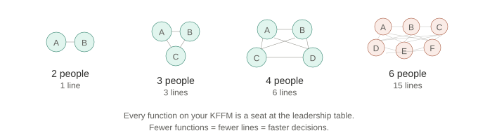
The KFFM also starts to articulate who your leadership team is. Each key function on the map represents a seat at the leadership table. If you have 12 functions on the KFFM, you are saying you need a leadership team of 12. Two people have one conversation to align. Twelve people have sixty-six. Every function you add multiplies the lines of communication that have to stay in sync. When you push to simplify the KFFM from 12 functions down to 4 or 5, you are also designing a leadership team that can communicate and make decisions quickly.
Key functions versus supporting functions. Key functions move a transaction forward. Marketing generates leads. Sales closes deals. Operations delivers the work. Customer success retains and grows the account. Finance collects the money. Supporting functions build and maintain the capability that makes the key functions possible. Product, engineering, HR, legal, IT.
Think of a company that builds lawnmowers. The manufacturing team designs and builds the lawnmower. But the key function flow is marketing to sales to distribution to finance. Manufacturing is a supporting function. It is critical. If the lawnmower is terrible, every key function gets harder. But manufacturing is not in the daily flow of moving a transaction through the business.
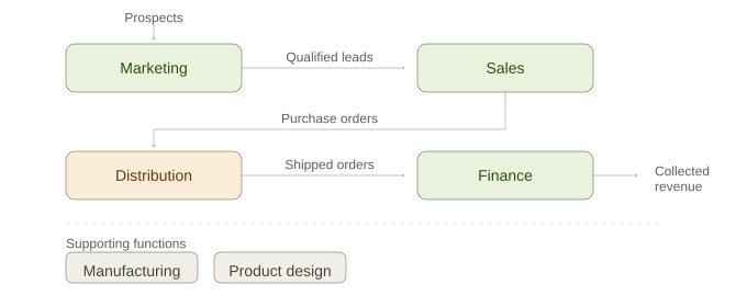
Product and engineering in SaaS and product-led businesses. In a SaaS company this distinction gets debated hard. Founders push back. They say the product is the thing the customer pays for. If the product is bad, no one converts or renews. So product must be a key function.
Here is the test. Even if that lawnmower comes with a Bluetooth subscription that generates recurring revenue every month, the manufacturing team is still a supporting function. They build and maintain the thing. They are not working day in, day out to move a transaction from lead to cash as fast as possible. If you make a crappy lawnmower, it will make sales difficult. But that does not put manufacturing in the key function flow. It makes it a supporting function with a red status. A supporting function's critical number might be something like platform uptime, release cadence, or feature adoption rate. Things that support the key functions but are not in the transaction flow.
SaaS product-led growth companies are different. There is no hardware to separate from the subscription. The product itself is the conversion engine. If your product has a free tier and the user has to convert to a paid tier, the product is doing the daily conversion work: onboarding flows, activation moments, in-app prompts, paywall mechanics. A user signs up, experiences the product, gets value, and becomes what is often called a product-qualified lead. The product function is moving transactions forward, not only building the thing that other functions sell. In that model the flow might look like: Marketing to Product (free tier activation) to Sales or Self-Serve Conversion to Customer Success to Finance. Product belongs in the KFFM. You will know which model you are.
Identifying widgets. Widgets are the nonfiscal things that flow between functions. They are not financial metrics. They are the things you count that eventually turn into money. Leads, qualified opportunities, signed contracts, delivered projects, active accounts, collected invoices.
Two principles to keep in mind. First, the first function in the map (usually marketing) is the hardest to define an input for because there is no upstream function handing it something. It is reaching out into a market. Start by defining the output of the first function (what does marketing hand to the next function?) and work forward through the map. When you come back to define the input, work backward from the output. If marketing outputs qualified leads, ask: for those qualified leads to exist, what had to happen first? Someone had to become aware of you. Then ask: can you count that thing? Website visitors, impressions, event attendees, demo requests. If you can count it and it correlates to the output, that is your input widget. If you cannot count it, keep narrowing until you find something countable that predicts the output.
Second, widgets must be things the function owner can control. Seats, not monthly recurring revenue. Delivered projects, not revenue. Collected invoices, not cash. Revenue is an outcome of the whole system. A widget is the thing one person owns and can influence through their daily work. If you put monthly recurring revenue as the widget for sales, the sales function owner cannot control pricing. They can control signed contracts or new seats. The revenue follows from that, but it is not the widget.
This is the distinction between a financial model and a KFFM. A financial model shows you whether you made money. A KFFM shows your team what they need to do to make money. One looks backward. The other drives daily behavior. If a widget only makes sense in a spreadsheet, it has probably drifted back into a finance tool. Widgets are what the entire team understands. People gravitate to the count of the widget they produce every day. That count connects directly to the key widgets on the KFFM. When the language of the widgets is clear and connected to the work, the whole team can align to a win. Building from the KFFM makes financial responsibility a team game rather than a finance function.
Branching paths. In most businesses, money does not flow through a single path. Inbound leads take a different route than outbound leads. Self-serve signups may skip sales entirely. Expansion revenue from existing customers enters through customer success, not marketing. The KFFM should show these branches. Different paths have different cycle times.
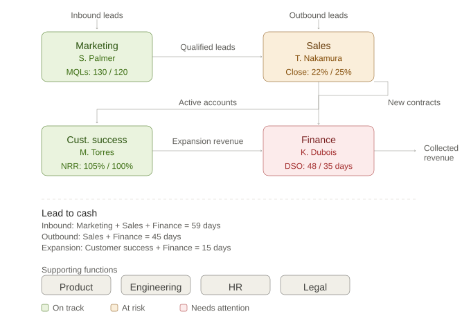
Color coding. Each function owner color codes their function: green (on track), yellow (at risk), red (needs attention). Start with intuition in the first iteration. Move to data-driven as the KFFM matures and critical numbers are in place. In a high-growth company, when one function goes super green, another often goes red because it was not ready for the increased volume. This is one of the most useful things the KFFM reveals. Color coding helps the team decide what the next priority should be.
Operating it as a scoreboard. Once the KFFM is mature, it can be run as a scoreboard. The KFFM provides the structure. The scoreboard is the practice of updating it at least weekly (daily in companies with the systems to support that) so each widget shows the current actual against its target. The whole team can see if the company is winning or losing. This is not a quarterly review artifact. It is an active, living view, and the act of updating it on the rhythm is what makes it a scoreboard.
As the system deepens, functional owners build Level 2 function flow maps for their areas and use them in the same way. The Level 2 maps become each team's scoreboard, connected to the Level 1 KFFM through shared widgets.
For the full operating rhythm around the scoreboard, including situation reports and the weekly leadership review, see Scoreboard Day and the Weekly Leadership Review.
Profit/X. Jim Collins called a company's key performance indicator the Profit/X. The X represents the company's economic engine. It is the unit where, if you improve profit per that unit, the whole business gets healthier.
The X usually emerges from the widgets on the KFFM. It is not always the billing unit. Southwest Airlines does not use profit per ticket. They use profit per plane in the air, because that is the denominator that drives the whole economic engine. Paradata, a subscription payment-processing platform, used profit per merchant. The question is not "what do we bill for?" It is "what is the one unit where, if we improve our profit per that unit, the whole business gets healthier?"
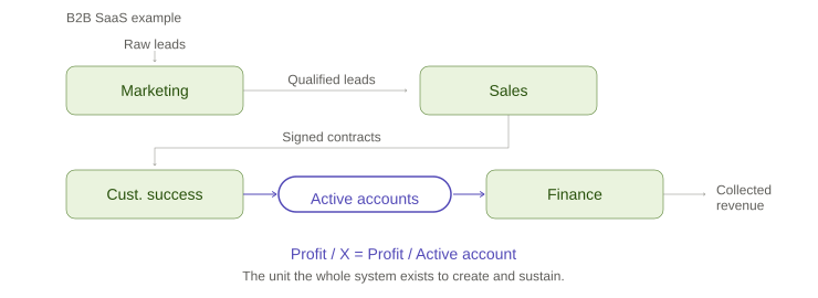
Take the B2B SaaS company we have been using as an example throughout this article. Marketing generates qualified leads. Sales closes contracts. Customer Success retains and grows the account. Finance collects the cash. A signed contract might look like the obvious X. But a signed contract is a one-time event. It does not capture whether the business is delivering profitably, whether the customer is retained, or whether revenue is collected. Profit per signed contract only tells you whether the Sales function is healthy. It does not tell you whether the whole system is working.
The better X for this business is an active account. An active account is persistent. It generates recurring revenue every month. The whole KFFM exists to acquire, onboard, retain, and monetize active accounts. Marketing acquires them. Sales closes them. Customer Success keeps them. Finance collects from them. When you improve profit per active account, every function benefits. That is the economic engine.
On the first pass, Profit/X is a hypothesis. The KFFM is how you test it. Pick the unit you believe drives the engine, run two quarters, and the data tells you whether to keep it or change it. Do not overthink it early on. Put something down and refine.
Lead to cash. Once your KFFM is mature and your widgets and cycle times are well understood, you can calculate how long it takes to go from the first input to putting money in the bank for each path through the map. Add up the days for each function. This number reveals where the bottlenecks are and where improvement has the most leverage. This is an advanced exercise. Get the functions, widgets, and critical numbers right first.
When to share beyond leadership. The KFFM lives with the leadership team while it is being built and refined. It gets shared with the broader team once the flow, widgets, and owners are stable enough that the message is clear and consistent. If leadership is still debating whether a function is key or supporting, or what the widgets are, it is not ready to share. What you want to show the team is a steady hand. You have a plan. You are giving them one thing at a time. A mental dump of half-formed ideas and conflicting messages creates confusion, not clarity. Premature sharing does more harm than good.
Put it on the wall. Physical or virtual. Keep it visible. Keep it updated. The KFFM is not a document that lives in a folder. It is the live view of how your business makes money.
If your KFFM is still rough and your widgets are not stable, stop here. Come back to the next section when you have clarity on what flows through each function.
The Functional Organization Chart: who owns what
Below is Pillar HR's Functional Organization Chart. It takes the key functions from the KFFM and lays out every seat in the organization, both the people running each function today and the open seats where Pillar HR plans to grow. Functions where one person owns more than one role are flagged in red. So are open seats. The combination tells you immediately where the bottleneck and the gap are.
Pillar HR's FOC. Sarah is flagged in red on two rows (Head of Company and Product Manager). That is the bottleneck pattern. Three seats are Open: Channel Manager, Field Manager, Knowledge Architect. Revenue Operations is co-owned by Ben F and David H, also flagged. Forty-three seats in total, organized under the Head of Company plus four leadership team members (Chief Financial Officer, Chief Revenue Officer, Chief Technology Officer, and Chief Marketing Officer reporting through Head of Sales, Head of Marketing, Head of Customer Success, and Head of Technical Support).
The FOC is the Functional Accountability Chart viewed from the perspective of the whole organization. It is an org chart organized by function rather than by title or reporting line. It shows the function, the person who owns it, and their title. Each function box is color coded to match its status from the KFFM (green, yellow, or red) so the health of the organization is visible at a glance. Supporting functions use dashed borders and are connected to the function they report to. If a function is accountable for subfunctions beneath it, that hierarchy is visible. People appear more than once if they own multiple functions. Open and future functions sit alongside the current ones, so the team can see where growth opportunities exist. Leadership uses it to gain clarity about how the organization is structured today and where it is growing toward. The whole company uses it to see where they fit. Review it as part of the quarterly planning process.
Function first. People second. Level 2 typically mirrors the key functions you named on your KFFM. Level 3 and below is where you decompose the work that makes each one actually happen. Names get placed against the structure last.
The Functional Accountability Chart: the measurement layer
Below is Pillar HR's full Functional Accountability Chart. Every key function, every supporting function, every subfunction, and every individual contributor seat gets its own row. Each row carries a mission, a critical number with green and red thresholds, a leading indicator, and a lagging indicator. The artifact the prompt produces also includes a glossary explaining why each metric was chosen and how it is calculated; that part is not shown here.
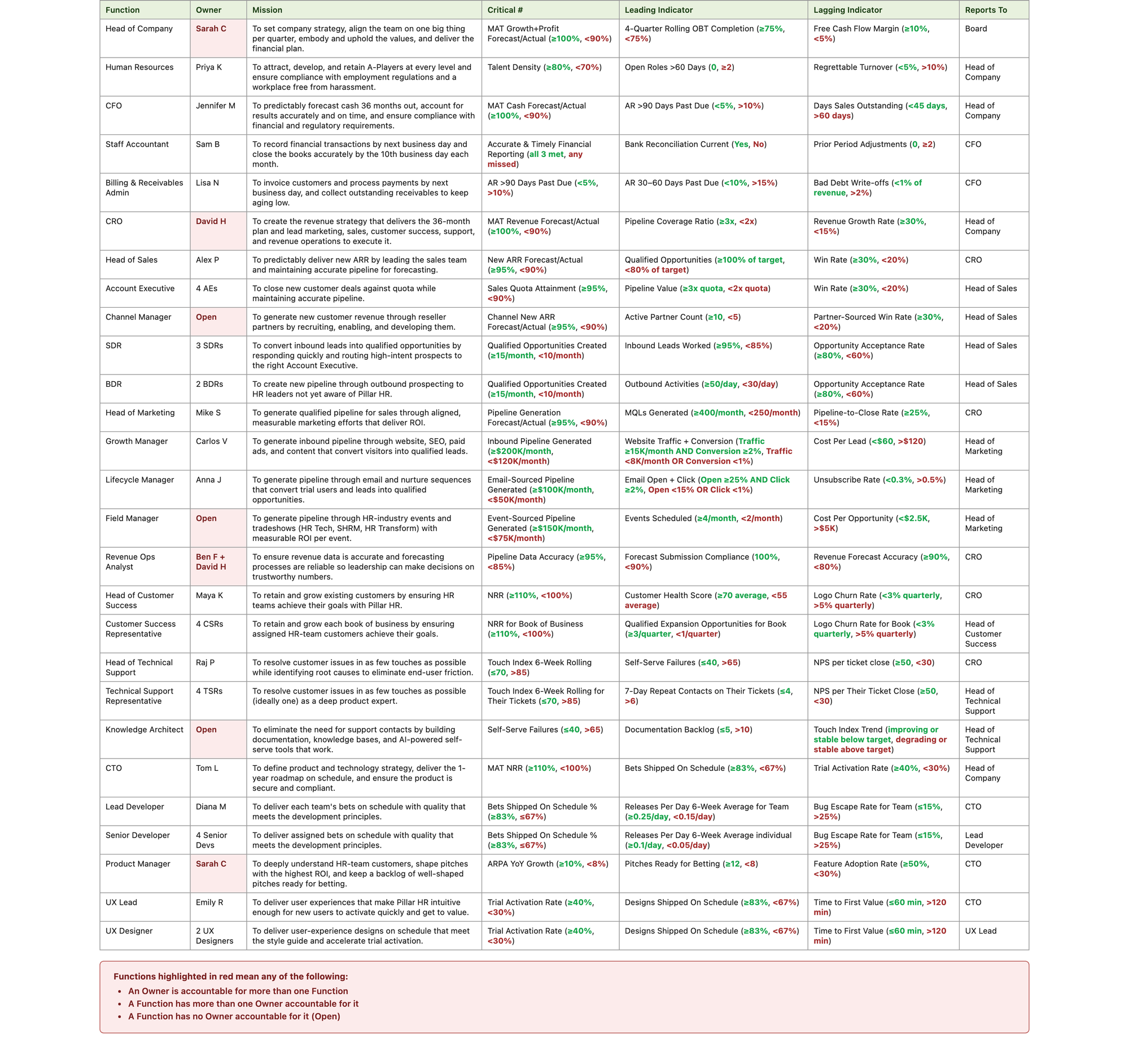
Pillar HR's full FAC. Owner cells are flagged in red whenever an owner is Open (the seat exists but is unfilled) or whenever the same person owns more than one function (the bottleneck pattern). Sarah is flagged on multiple rows. Several seats are Open. Every function, key and supporting, has a complete mission, critical number, and indicator set.
By the time a team builds their full Functional Accountability Chart, they should already have a stable KFFM with understood widgets. You cannot pick the right critical number for a function until you know what flows into it and what flows out of it. Without widget clarity from the KFFM, you are guessing at metrics in a vacuum.
What the FAC contains. For each function: the owner, a critical number with green, yellow, and red thresholds, a leading indicator, and a lagging indicator. I also include a mission statement for each function. This is my addition, not standard practice. I find it forces clarity on why the function exists. Not what it does. Why it is there.
Picking the critical number. The critical number is the one metric that tells you if the function is doing its job. It must come from the KFFM widgets. Never invented in a vacuum. The critical number is typically the lagging indicator for the function. It measures what the function produced. The output. That is by definition lagging. The leading indicator predicts whether that output will happen. Pipeline coverage predicts close rate. Qualified opportunities predict new revenue. The lagging indicator downstream confirms the quality of what was delivered. Churn rate confirms whether the revenue sales brought in is sticking.
The testing criteria. If this number is consistently green, would you reasonably say this function is doing its job? If this number goes red, would you know something needs to change? Can the owner materially move it by changing how they run the function, assuming the promised inputs arrive? By the end of the day, can they tell whether they had a good day or not, because they know what their critical number is? If the answer to any of these is no, it is the wrong number.
The cadence of the read. Some critical numbers don't read cleanly on a single quarter. Billable realization swings on whether a big matter closed in week 13 or week 14. Originations swing on a conflict check. Shop-floor scrap rate swings on a supplier change the function doesn't own. For these, define the critical number on a trailing window (typically four cycles) rather than the single cycle. The Green and Red thresholds apply to the trailing read, not the single-cycle read. The current cycle still gets a Yellow, Green, or Red color on the KFFM, but the threshold is calculated against the rolling number. Use this option deliberately. Trailing windows hide drift if the window is too long, and they earn their place only on numbers that have calendar or system noise the function doesn't control. The default is single-cycle.
A few examples. For Sales, the critical number might be new contracts closed or close rate. The leading indicator is pipeline coverage. If pipeline is thin, the sales function will miss its number no matter how good the team is. The lagging indicator is revenue growth rate, which confirms what already happened but cannot be changed.
For Customer Success, the critical number might be net revenue retention. The leading indicator is customer health score. The lagging indicator is logo churn rate.
For Finance, the critical number might be collection rate or days sales outstanding. The leading indicator is invoices past 30 days. The lagging indicator is bad debt write-offs.
Key functions versus supporting functions in the FAC. Both key and supporting functions get entries. Both have a Reports To field showing which function or seat the row is accountable to. Key functions have critical numbers tied to KFFM widgets. Supporting functions have critical numbers tied to their enabling role. The reporting line carries into the Functional Organization Chart. Product's critical number might be platform uptime or release cadence. Engineering's might be bets shipped on schedule. Human Resources' might be talent density. These are not in the daily flow of cash, but they are critical to the health of the functions that are.
Introducing the escalation protocol gradually
You do not introduce escalation on day one. You install the scoreboard first, model the behavior at the top, hand ownership down, and only then enforce a protocol. The progression has four steps.
First, make the numbers visible. Put them on a scoreboard. Let people see their critical number and evaluate their own performance.
Second, have leadership model it. The CEO and leadership team score themselves and share openly before asking anyone else to be held to their number. They should use the escalation protocol on themselves first, demonstrating how it works and why it is useful. When the CEO writes a situation report for their own red number and shares it with the team, the message is clear: this is not a punishment. It is a tool for structural improvement.
Third, gradually empower team ownership. As people get used to seeing the numbers and understanding what drives them, introduce the expectation that each owner is accountable for their critical number.
Fourth, introduce formal escalation. Only once the numbers are understood, the scoreboard is a habit, and ownership is established should the escalation protocol be enforced.
If you come in on day one and say "whole new system, here is your number, hit it or you are fired," people will look at you like you are crazy. Put the numbers out there. Let people get used to them. Let them evaluate how it works. Show your own scoreboard first. Then over time say: "I want to empower you to own this number. Because you own it, and I am not going to micromanage you, I need you to commit to what that number will be so the next person in the chain can make their own number." That is how you step away from telling people what to do and move to telling them to be accountable and transparent for their work. It will seem like it is not working for a long time. It is a big change and it will take at least a year.
Where this lands eventually is the mature-state escalation protocol: one week of red triggers a written plan (situation, cause, correction, follow-up); one quarter of red triggers a performance improvement plan; two consecutive quarters of red triggers a seat decision. For the full detail on how situation reports work and the weekly rhythm around them, see Scoreboard Day and the Weekly Leadership Review.
Connecting to the scoreboard. The FAC defines the critical numbers. The KFFM displays them. The FOC tells you who owns each one. Together the three tools provide the foundation a scoreboard sits on top of. The scoreboard itself is the weekly or daily update rhythm that runs against them. When a critical number goes red on the scoreboard, it triggers a situation report, a structural correction, and a follow-up date. That operating rhythm is covered in detail in Scoreboard Day and the Weekly Leadership Review.
KFFM, FOC, and FAC
Run the three guided AI prompts in sequence. Each one builds on the last. 90 to 180 min total.
Why it matters
The KFFM and FAC together connect strategy to weekly execution. The KFFM shows how the company makes money. The FAC defines what success looks like for each function. The FOC shows who owns it. Update them every week and you have a scoreboard that makes all three visible to your team in one place. That picture covers everything inside your walls. The other half, the competitors fighting for the same customers, is where Who Are You Really Competing With? picks up.
Building from the KFFM makes financial responsibility a team game rather than a finance function. Every function owner sees how their widget contributes to the whole. Every person can say whether they had a good day by looking at a number they control. Finance translates the widgets into a forecast, but the team owns the inputs that drive it.
That connection is how you build a high-performing team. Not through motivation, but through clarity.
Find the AI opportunities to future-proof your company
There is one more thing the KFFM and its Level 2 and Level 3 function flow maps make possible that most founders have not considered.
Every function on the map already defines what it receives, what it must produce, the critical number it is measured against, and the time it takes. Those are the exact criteria you need to evaluate whether a function, or a subfunction, could be performed by an AI agent.
Start with the simplest subfunction you can find. Something with clear inputs, clear outputs, a measurable critical number, and no downstream consequences if it does not work properly. The risk should be small. The win should be obvious. If a human in a Level 3 subfunction processes 10 widgets per day, and an AI agent can process 100 per day around the clock, the impact cascades up through Level 2 and Level 1. Days to money drops. Volume increases. The functions downstream suddenly have more to work with. But you start small, prove it works, and expand from there.
The KFFM also tells you where not to automate. If a function's value depends on human judgment, relationship, or trust, the critical number will punish a bad automation quickly. The scoreboard catches it.
The KFFM was designed to create clarity and accountability for human teams. It turns out that the same structure provides the evaluation framework for designing your business with AI. If you have been wondering where to start with AI, start here. Build your KFFM. The automation candidates will reveal themselves.
KFFM, FOC, and FAC
Get your KFFM, FOC, and FAC in three guided AI sessions.
The Pillar HR KFFM, FOC, and FAC shown above are the actual outputs of the three prompts. The prompts produce the same kind of artifacts for your business: your own KFFM, FOC, and FAC. They are available at darlison.com/tools/.
This post is part of a series on the tools and processes we used to transform our organization from no accountability and constant firefighting into one that operated with intention and could scale.
Values | How Your Company Makes Money | Scoreboard Day | Scorecards | Skip Level Reviews | Scorecard Reviews | Compensation | Who On Your Team Is An A-Player?